Our logo mark tells the visual story of who we are. It combines the shapes of an I and an M with the soft waves of the ocean.
The logo mark should be used wherever we want to be recognized in a simple and elegant way.
Our logo mark should stand alone and while the type can also be placed on a page or layout, the two should never be placed together.
Logo Mark on Dark background
Logo Mark on Light background
Our logo type spells out the company name. It should be used as a standalone logo whenever we need to remind people what our company name is, and in situations where our mark is not enough to explain who we are.
Our logo type should stand alone and while the mark can also be placed on a page or layout, the two should never be placed together.
Logo Type on Dark background
Logo Type on Light background
Do not use the logo mark and logo type in any lockup or connected in any way.
Do use the logo mark and logo type in a page or layout together, as long as they are displayed separately and not connected.
Do not combine our logo with partner, vendor, and client logos.
Do show our partner and vendor collaborations by using appropriate symbols and ensuring clear space is adhered to.
"IM" serves as both our initials and a declaration of identity. This dual meaning powers our brand messaging framework.
Clear Space
Always maintain adequate clear space around the logo. The minimum clear space is equal to the height of the "i" in "im".
Minimum Size
The logo should never appear smaller than 80px wide for digital or 25mm for print to ensure legibility.
Usage
Use the light logo on dark backgrounds and the dark logo on light backgrounds. Never modify, rotate, or add effects to the logo.
The brand name is IM Digital. Always.
Pronounce the letters separately: "I-M Digital." Never "I Am Digital."
Always use the full name. Never shorten to just "IM."
Avoid referring to the brand as "IMD."
The I and M don’t stand for anything. Never write "I.M. Digital."
Always capitalize both letters: IM. Never "Im Digital."
Never refer to the brand as "Imagination Digital" or "Imagination Media."
Don’t capitalize the first letters of "Imagination" to allude to the brand name.
Primary Colors
Air
#F7F8F4
Deep Teal
#03171C
Background Gradients
Light Gradient
#F7F8F4 → #D9DDDC
Dark Gradient
#03171C → #000000
Greys
Primary Typeface
Inter
Display Medium — 40px / Light (350)
The most memorable experiences
Body — 18px / Regular (425)
A powerful and intelligent system is built in deliberate phases. This is our system of work — a clear framework and journey that moves from initial assessment to a proprietary system, built for your command.
Body / Links — 16px / Regular (400)
About Capabilities Work Solutions Partners
Detail / Label — 10px / Medium (500)
Return on imagination
Accent Typeface
Fraunces
Alternative Display Small — 24px / Light (325)
This is the purpose of our design practice: a thousand deliberate choices ending in absolute clarity.
Editorial Display — 36px / Light
Where the art of storytelling meets the science of commerce.
On Dark Background
The most memorable experiences feel discovered, not constructed.
Character Set
Aa Bb Cc Dd Ee Ff Gg Hh Ii Jj Kk Ll Mm Nn Oo Pp Qq Rr Ss Tt Uu Vv Ww Xx Yy Zz
0 1 2 3 4 5 6 7 8 9 ! @ # $ % & * ( )
Type Tester
Icon Style
IM Digital icons follow a minimal, line-based style that mirrors the clean precision of our brand. Icons use a consistent 1.5px stroke weight, square line caps, and align to a 24px grid.
Stroke Weight
1.5px consistent stroke width across all icons.
Grid
24px base grid with 2px padding for optical alignment.
Style
Outline only. No fill. Rounded line caps and joins.
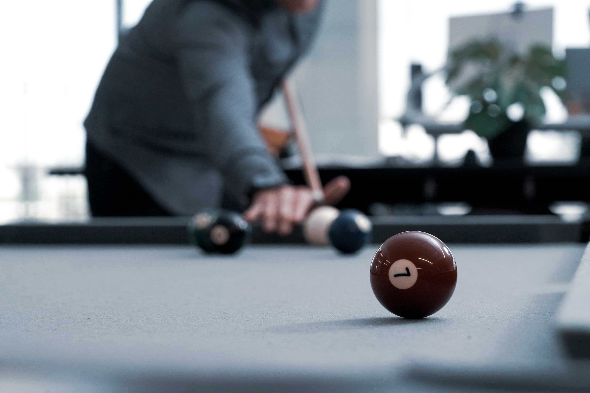
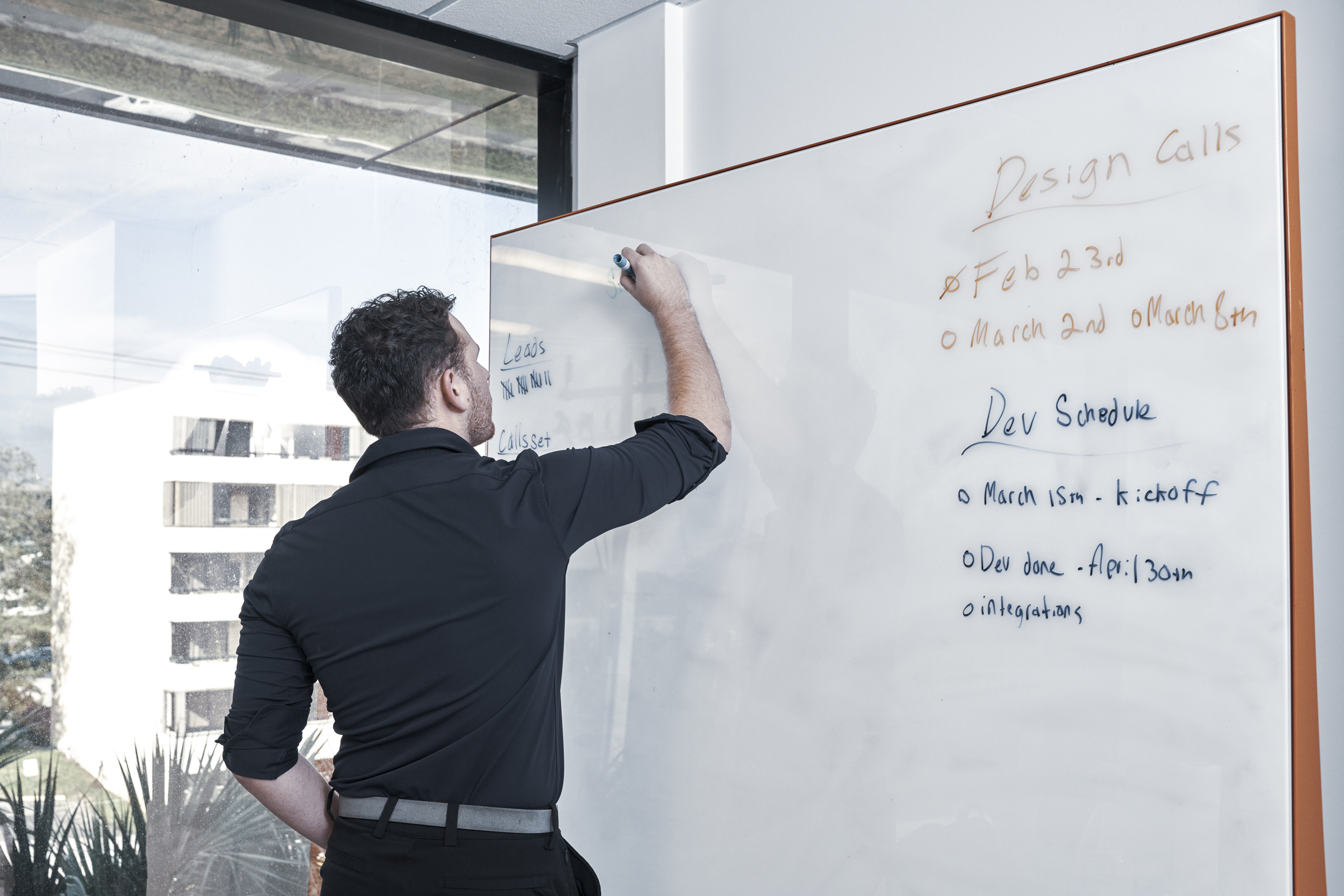
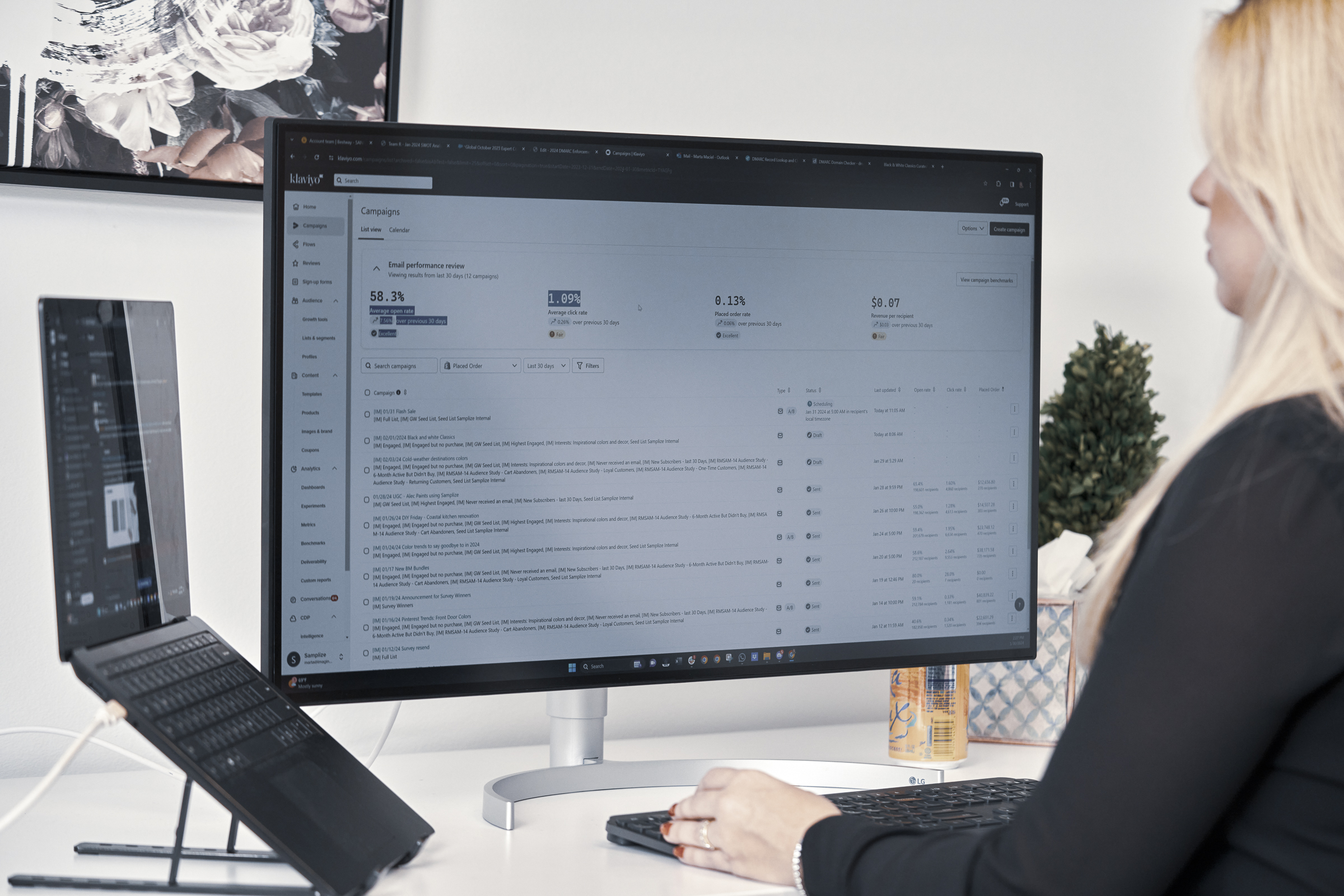
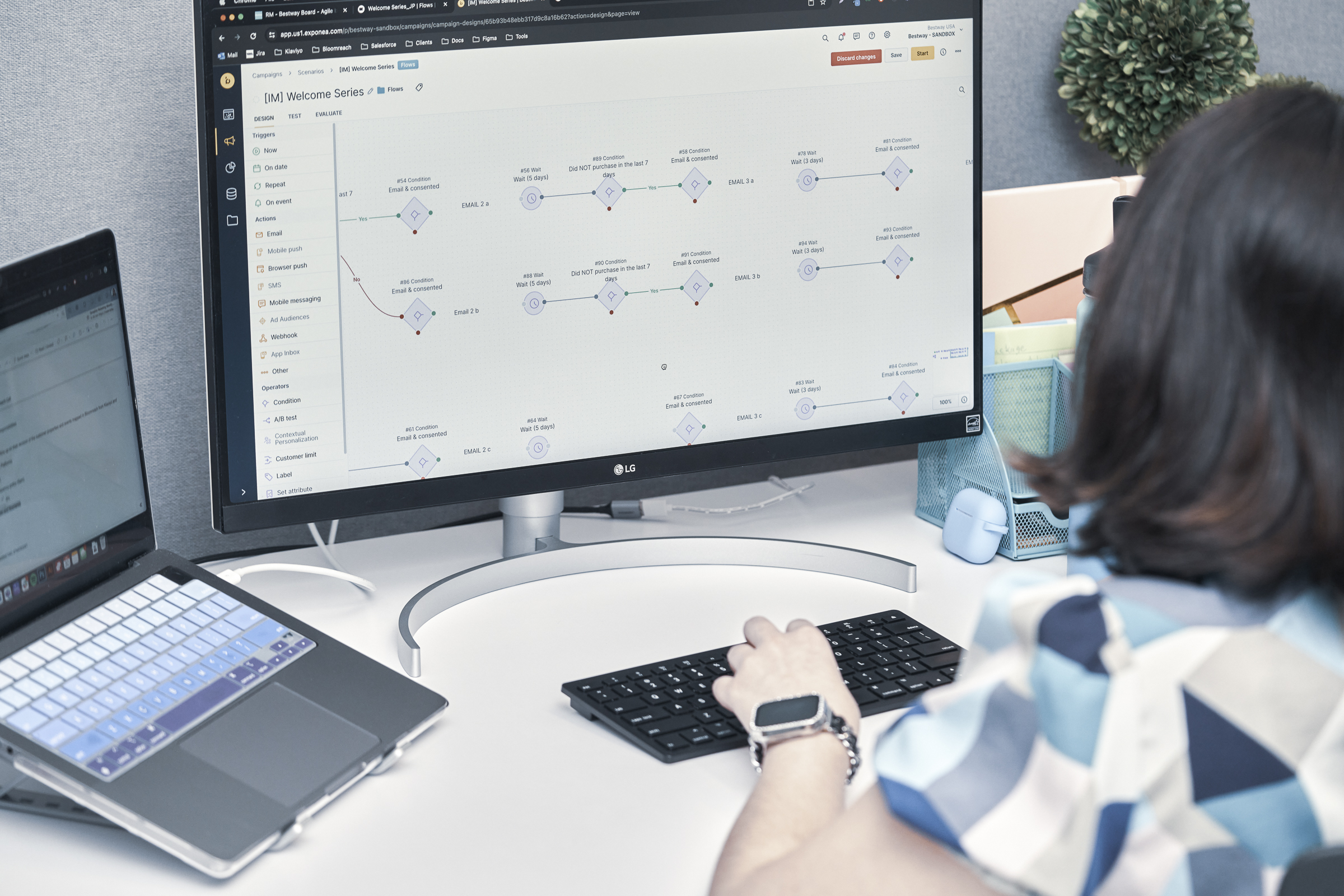
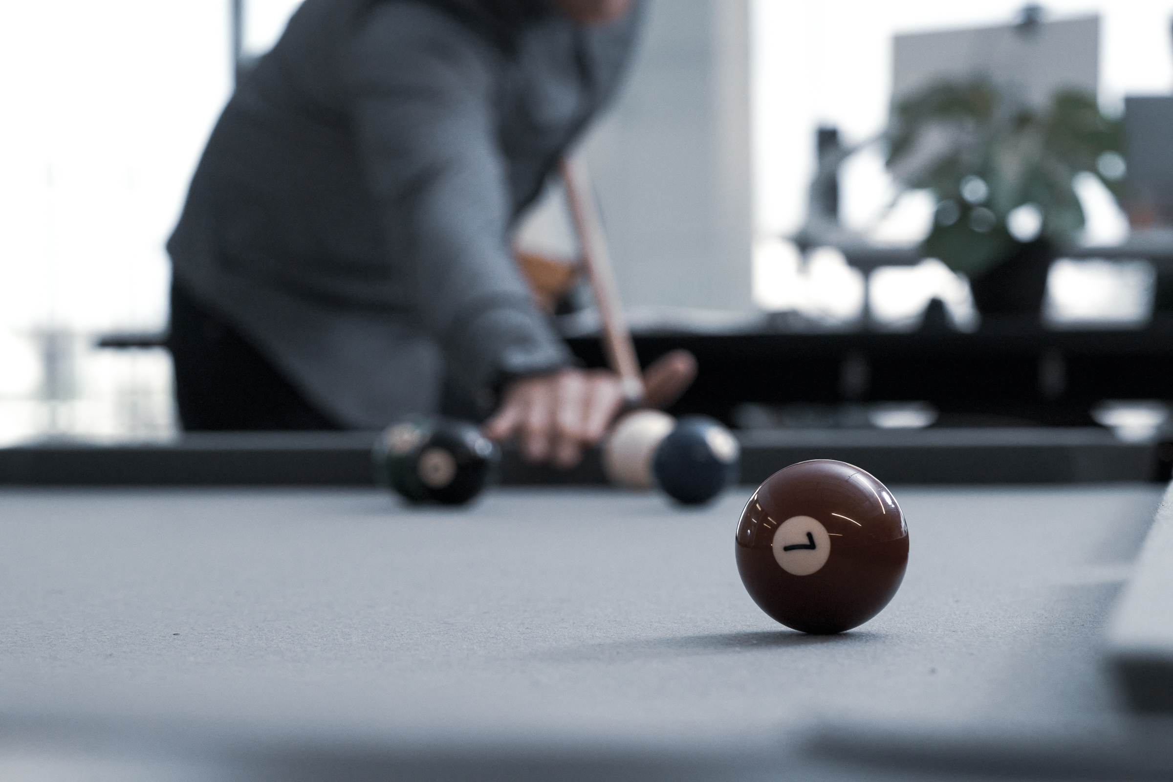
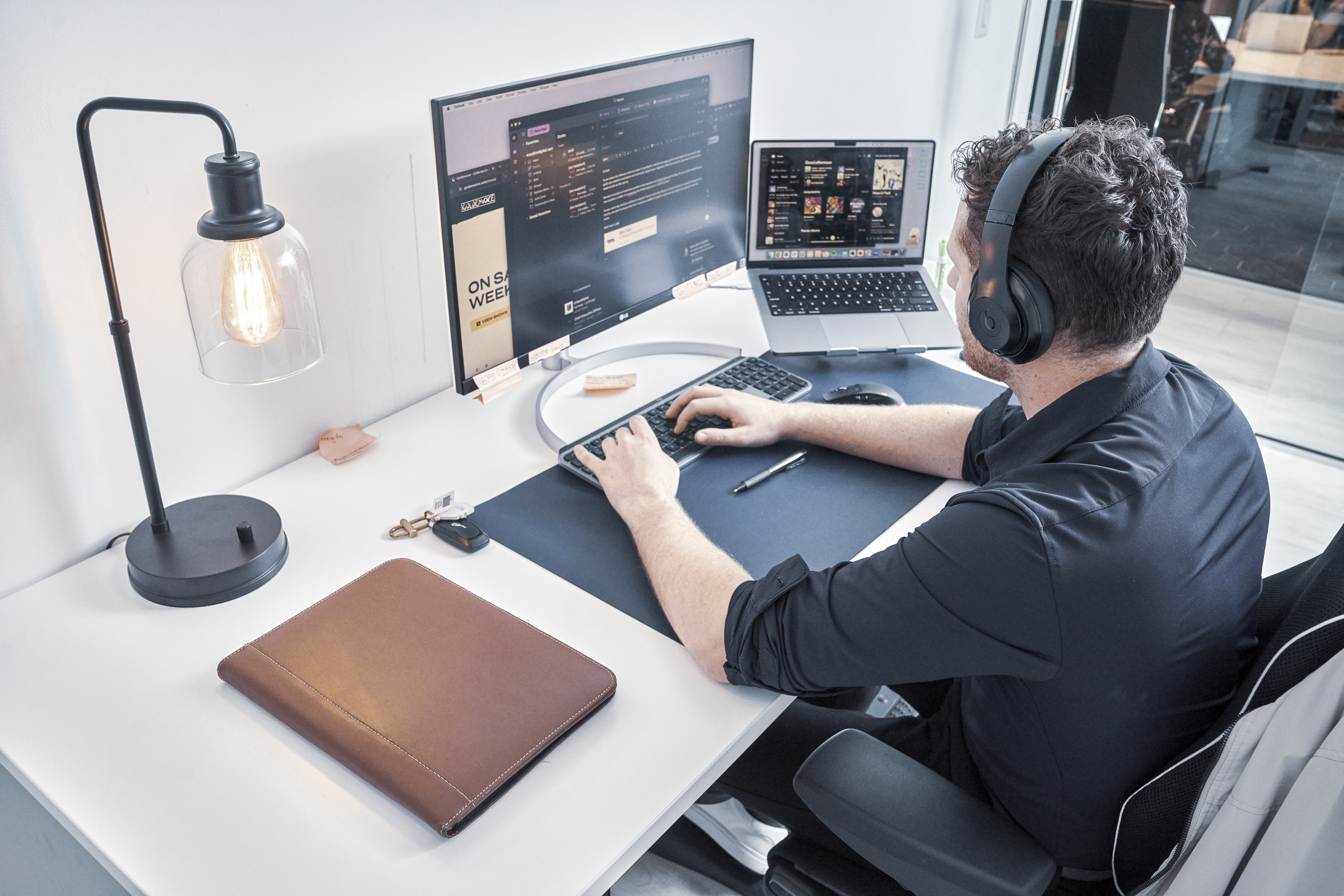
Photography
Direction
Our photography is modern, intentional, and editorial. We capture the authentic energy of office life — natural light, candid moments, and compositions that create visual tension through shallow depth of field and thoughtful framing. Images should feel discovered, not staged.

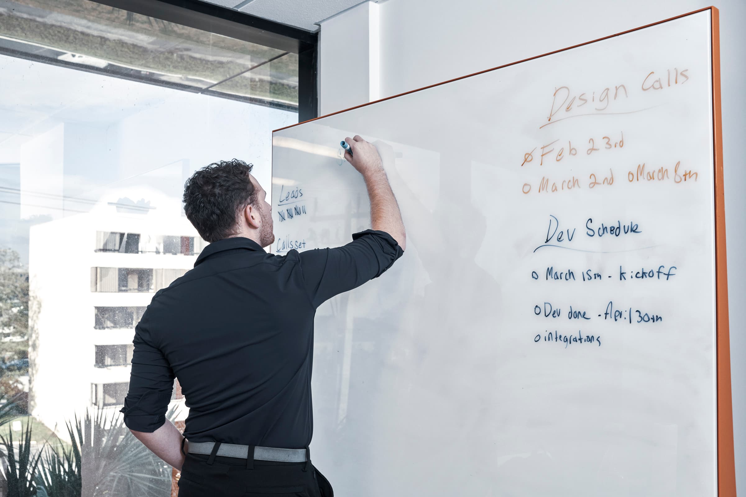


Our office lifestyle photography follows eight core principles that ensure visual consistency, authenticity, and editorial quality across all brand touchpoints.


Showcase the culture and identity of the workplace through candid moments and telling details. Focus on the energy, the focus, and the human connections that define our environment.


